“Good design is obvious. Great design is transparent.” Joe Sparano's line sums up why Gestalt principles matter in games.
Since the early days of Pong and Pac-Man, game designers have used these principles, often without knowing it. Today they apply them on purpose to make interfaces clearer and worlds more immersive.
Think of a jigsaw puzzle. Gestalt principles are the rules that help us put the pieces together. We group similar things, fill in missing details and track moving objects, and we ignore whatever doesn't seem important right now. This is why good game design feels intuitive. Knowing the rules of perception lets us build clear, engaging environments.
01Proximity
Our brains group elements that are close together into a single unit, and assign other elements to another group by default.
Picture a grocery shelf. Rows of cereal boxes close together read instantly as the cereal section, while a lone box on another shelf gets tagged by our brain as something else entirely.
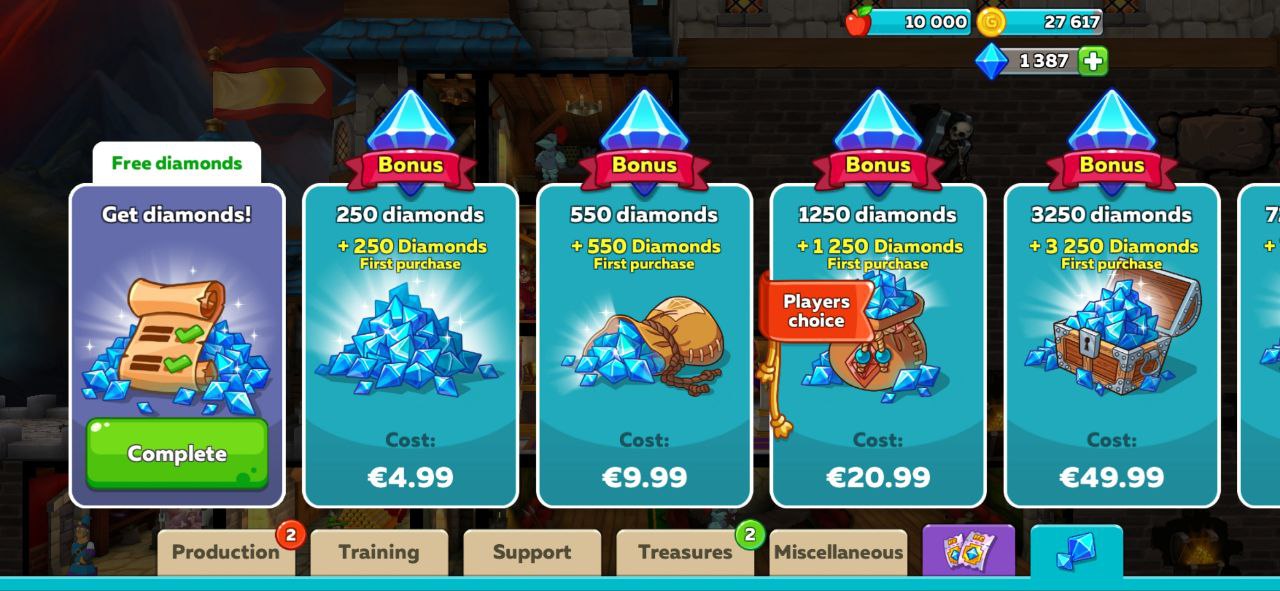
Games use this to group rewards or store items. Ignoring it causes misreadings. A grid of product cards with prices makes navigation easy, but if a price sits closer to the neighbouring card, players won't know what it costs. Where do you expect to find a price on a shelf? Right under the product.
It can backfire. Too many elements packed together become clutter. Keep related things close for clarity, with enough space between them to tell them apart and tap them.
02Similarity
Our brains group similar things and assume elements that look alike work alike. It is a handy way to organise information and guide players without overwhelming them.
It is also how we make sense of the world. Similar things in nature usually have similar functions: birds fly and sing, and all cats love boxes, even lions. It lets us guess what something does the first time we see it.
Take any shooter where weapons come with different customisation options and levels. Players would be lost without general types such as shotguns, rifles, knives and shields. With types and the similarity principle, you need fewer unskippable tutorial explanations (keep an info section for curious players).
Breaking the principle has value too. Games get boring if everything follows the same types. One unique weapon brings surprise and curiosity. High on Life is built on this idea.
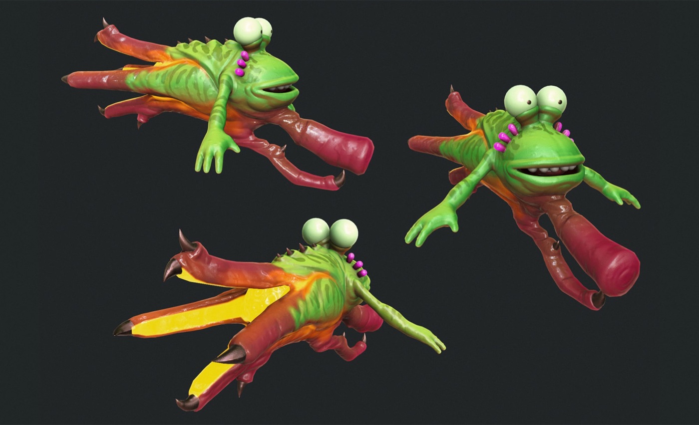
Imagine adding one of those odd-looking weapons during an event. Just don't overuse it.
03Continuity and common fate
Our minds prefer smooth, continuous paths to abrupt changes. This helps us group items and predict what happens next. A car that drives into a tunnel and comes out the other side is still the same car. Magicians use this: you watch for the coin from one direction and miss it arriving from another.
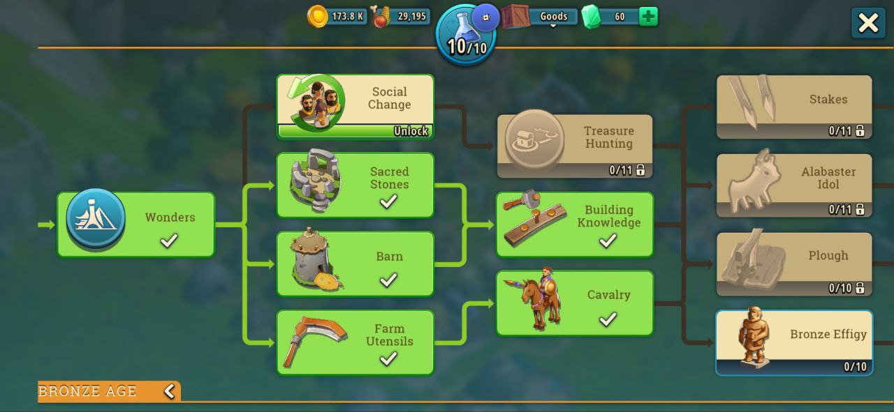
Battle passes, reward tracks and ability trees rely on it. If one element unlocks only after another, they sit on the same line. Otherwise players struggle to follow the logic.
Step away from it carefully, or players won't be able to predict outcomes. Souls-like games break it on purpose with enemies' jerky movements, which makes the moment to block or dodge harder to read and the fight more challenging and fun.
04Closure
Our minds fill in gaps to see complete shapes and ideas. It is the base of minimalist art and something we use every day. Try finding something in a dark room at night: contours blur, but your brain still finds the door or the glass of water.
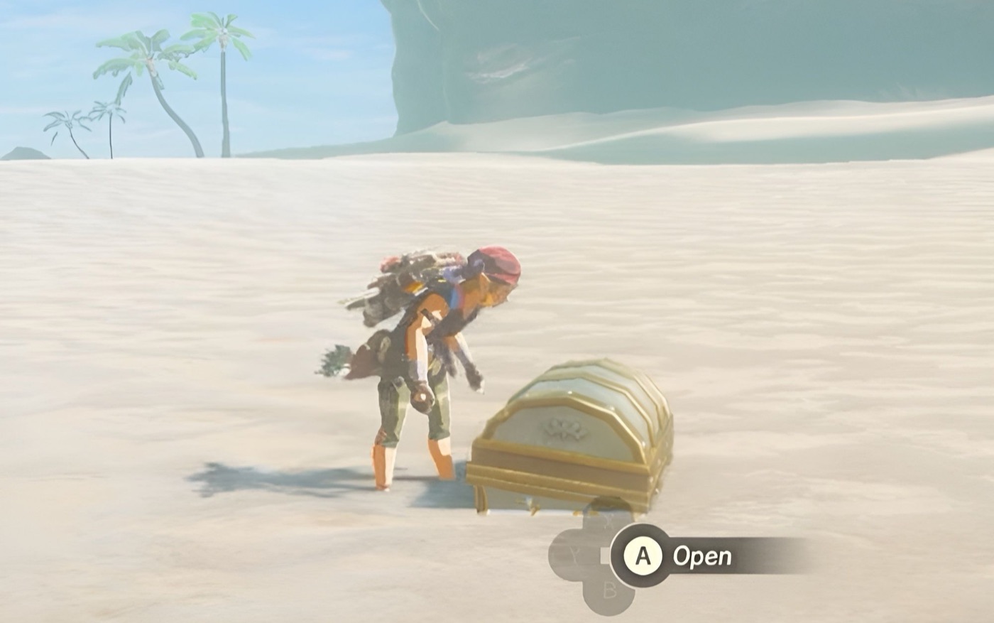
Games use closure in character design and puzzles, and to hint at a chest hidden in a bush without drawing it fully. But simplify too much and the design becomes unclear. Finding the balance between simplicity and clarity is where testing matters: look at your game through your players' eyes.
05Figure and ground
Like a spotlight in a theatre, our brains separate the main focus from the background. Looking for your car in a crowded car park, every car seems equally important. Once you spot yours, it comes forward and the rest fade back.
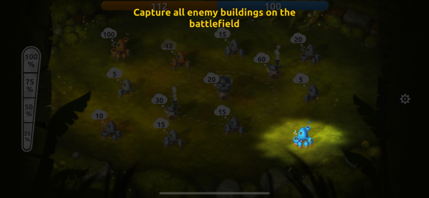
In UI this is clearest in buttons, which differ from other elements in colour and shape. The trouble starts when several live-ops icons, a store link, the play button and a bundle pop-up share one screen. When something is in focus, everything else becomes background. To shift attention to another element:
- Use a less busy perceptual channel. If players are focused on visuals, for example aiming, add a voice cue. If they are focused on sound, add a visual one.
- Break similarity and use change. In a game full of detailed scenery, highlights and a glance animation will pull attention to the right object.
Use them sparingly. When there is too much light on the stage, nothing is highlighted. When the stage is dark, every eye is on the spotlight.
06Symmetry and order
We love balance and patterns, and we see symmetrical elements as one group. Symmetry gives a layout a tidy structure that is quick to grasp, so people focus on content instead of decoding the layout. Think of a well-set dinner table: once you decode one place setting, you understand them all.
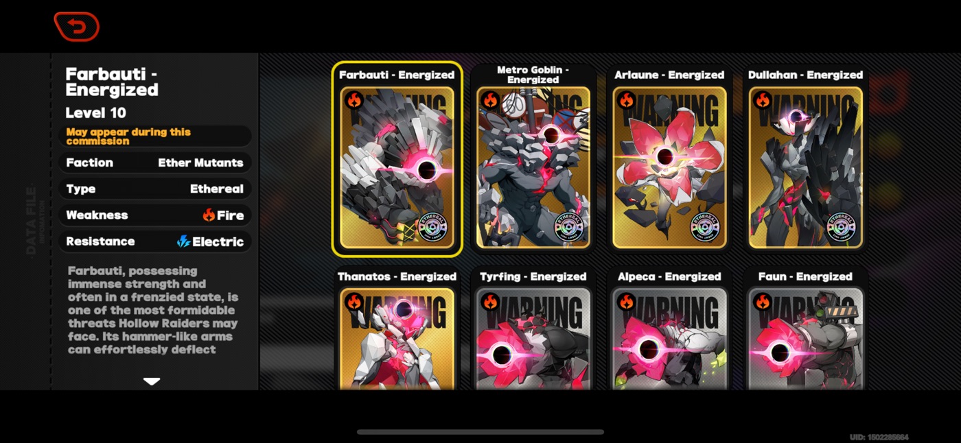
This helps any screen with many elements, from shops to puzzle games: put things on a grid and a cluttered screen becomes calm. But remember figure and ground. Symmetrical elements easily become background, so break the symmetry when you want to point at the main dish.
07Simplicity
Our brains look for ways to save energy, so strip away what isn't needed and present information in its simplest form. You can see it in every worn path cutting the corner of a lawn. Some places let people walk first and pave the paths afterwards.
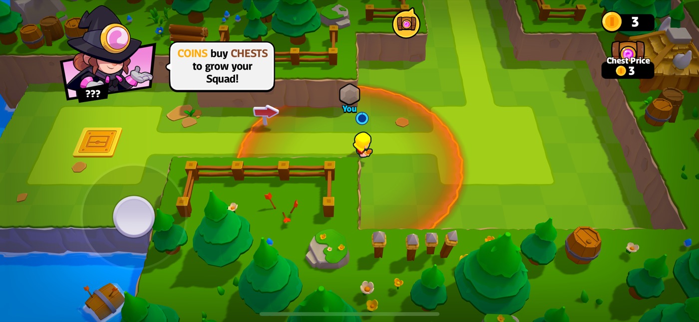
Players don't read explanations, hints or tutorials. If you can show something with a picture, do. If you can't, simplify: bullet points, headers, storytelling.
The tricky part is that oversimplified gameplay loses interest. Experienced players need more depth and more detail about mechanics. So test with players, find where their engagement falls, and give experts extra information while keeping the main flow simple.
—Conclusion
Many things decide a game's success, and understanding players is one of the most important. Gestalt principles make the player experience more transparent. The more I work on this, the more I see how much success depends on players' feelings and perception. Games are not only what we see on the screen. They are how they make us feel.